Chris O'Brien Lifehouse

Caring for
Carers

UX RESEARCH
UI DESIGN

Scroll down to learn more

SUMMARY

Chris O'Brien Lifehouse is a not-for-profit integrated cancer treatment in transition of migrating to WordPress, but their website suffered from information overload.

A second iteration of the website based on the insights was designed, including the Homepage, Find a Doctor page and search results page.

PROJECT TIMEFRAME

Two weeks from start to finish, the first week focused on research, the second week focused on prototyping and testing.

RESPONSIBILITIES

Working alongside another UX designer, responsibilities included:

Interviewing patients, carers and GPs for insights and empathy

Analysing Google Analytics

Usability testing of the live site

Card sorting of site features

Wireframing and Prototyping the second iteration of the site.

INTERESTING FACT

Through interviews, it was discovered that carers rather than cancer patients were the primary website users.

1
EMPATHY
  • Competitor research of different hospitals was done to identify potential elements missing from the Lifehouse website
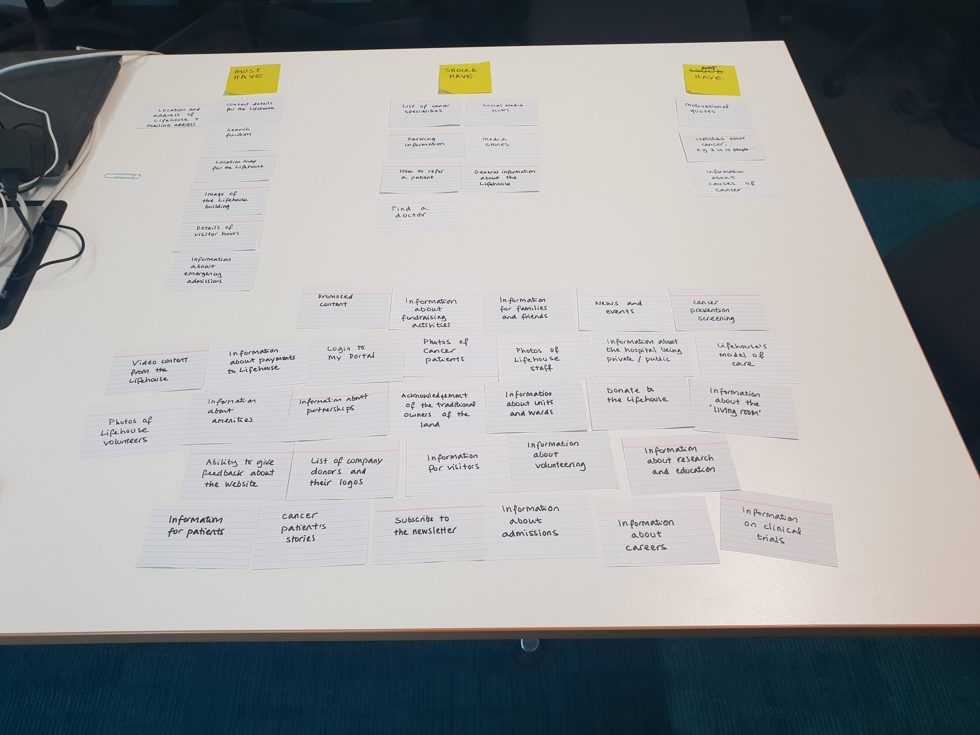
  • Card sorting was done with participants to identify which elements must/should/could be included on the website
  • Google Analytics of the website were analysed to identify demographics and interactions
  • Casual research interviews were conducted with 3 Patients, 1 GP and 2 Carers to identify their purpose of using the website
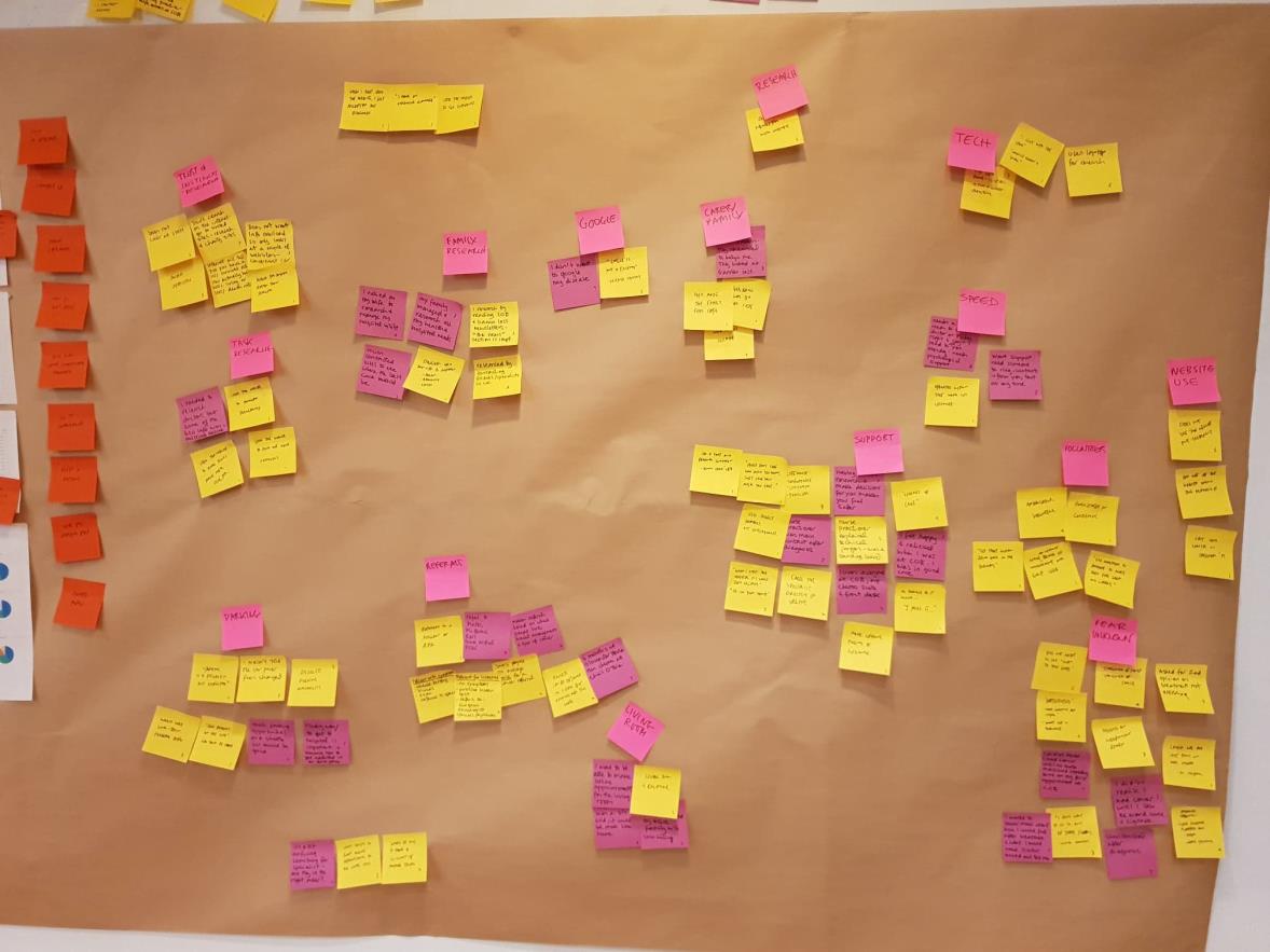
  • Affinity Mapping was done to highlight points of interest
2
DEFINE
  • Key insights were identified by card sorting the highlighted points from Affinity Mapping
  • 3 Personas were created to represent the following:
    • Worrisome carer
    • Optimistic older patient
    • Unaccompanied young patient
3
IDEATE
  • 6Up 1Up activity was performed twice to identify how to improve relationships between carers/patients and doctors and also the hospital
  • Project Task opportunities were voted on by Lifehouse staff after presentations
  • The Carer Information Page elements were identified through affinity mapping and card sorting
4
PROTOTYPE
  • Prototypes were created using Adobe XD, Adobe Photoshop and Adobe Illustrator
5
TESTING
  • Lab Usability Testing was performed with three participants to assess aesthetics and interactions
  • Takeaways were identified to document the end of sprint
Competitor Research
Card Sorting
Google Analytics
Affinity Mapping

Competitor Research

Various competitor homepages were printed including:

Peter MacCallum Cancer Centre
Royal North Shore Hospital
Royal Prince Alfred Hospital
St Vincent’s Private Hospital
Mater Hospital, North Sydney
Cancer Council NSW
Cancer Institute NSW
MacMillan Cancer Support, UK
Children’s Cancer Institute Australia
The Fred Hollows Foundation

Post-it notes were used to annotate the parts of the websites that were liked, and afterwards, all the different elements were transferred onto cards for a card sorting activity.


Card Sorting

Three participants were asked to sort a series of cards featuring website content for the homepage into three categories:

Must have/not have
Should have/not have
Could have/not have

The most popular features can be seen below:

Must haves for the homepage

All 3 participants (patients are carers) agreed on these

Details of Lifehouse location, address and mailing address

A search function

Location Map

Contact details

Image of the Lifehouse building

Visitor hours

Information about emergency admissions

Must haves for the homepage

2 participants (patients are carers) agreed on these

Information about the hospital being private and public

Parking information

Information for visitors

Lifehouse model of care

Information on amenities


Google Analytics

Google Analytics gave a lot of insight into who the actual website user is.

The average age of the user was 25-45, while the average age of a patient was 55.
In addition, most people come from Google to reach the website.
Also, the Find A Doctor page had a 60% dropoff rate, with the hunch that people gave up finding their doctor on the page.

After interviewing patients, it was discovered that patients avoid the website entirely, whilst carers sought information as they were concerned.

Also insightful was that the older they were, the more likely they were to search for complementary therapy.


Affinity Mapping

After analysing the interviews, Google Analytics and other research, every point of interest was put onto a post-it note. An open card sort was then completed, where they were grouped based on similarity, which identified the insight.

Key Insights
Personas

Key Insights

From interviews and other research, 16 insights were discovered:

  1. When patients are looking for information on the Lifehouse website, they use the search tool because the navigation has too many options.
  1. Both GP and patients use the website to find out more about their doctor.
  1. Finding directions and transportation options to the Lifehouse on the website is a difficult task for most users.
  1. During diagnosis, families feel like they have the responsibility to research, plan and organise hospital treatments and visits.
  1. Many patients found it difficult to access the Living Room page from the home page.
  1. Patients do not trust Google because of misinformation but most people discover the Chris O'Brien site by searching on Google.
  1. Patients go through multiple screenings and those that qualify, proceed to urgent care by the GP directly contacting the relevant hospital specialist.
  1. During treatment, there is an excellent relationship between the doctor and patient (able to be contacted directly through phone).
  1. Former patients were satisfied with their care and left with very positive memories that they reminisce about - they miss that 'good feeling’.
  1. Patients and carers do not use the website during treatment, only during diagnosis.
  1. Parking information is general - no information on disability, long-term and pricing. They also wanted to know about lift access from the carpark and whether there was access via the lift to all floors
  1. Family members want a trustworthy place with up-to-date research.
  1. Patients don’t acknowledge and process they have cancer (reacting in shock) until their first appointment.
  1. People are looking for an emotional connection with their treating doctors to increase the trust factor and reduce their fear.
  1. User testers told us they were interested in trials. They want details of dates, gender criteria, eligibility. They want to know about global trials. They want to know the doctors doing the trials.
  1. Information about Private and Public is important. This had not been explained to one patient by their doctor and they were now being hit with unexpected fees.
 

Personas

From the empathy research and key insights, three personas were created:

Sarah was representative of the worrisome carer.
Richard was representative of an optimistic older patient.
Katie was representative of a younger patient dealing with the cancer process on her own.

Sarah, 45

Carer

Sarah, 45, married with grown children. Her husband has been newly diagnosed with an agressive cancer. She has left her job to support him.

Goal

To feel like I know everyone who is involved in treating my partner and have a real connection with them.

Pain Points

I can't find enough information on our doctor. I want to see their photo and understand what they are like as a person.

Needs

I am overwhelmed and feel useless, I need practical advice: how to get to the hospital, where to park, how to plan for my partner's treatments, and make sure he has the best medical team.

Emotions

Active, Pressured, Organised, Worried

Richard, 55

Patient

Richard is 55, married with three children in their 30s. He is a retired businessman who livs with his life. He is fit and active and recently diagnosed with Stage 4 Prostate Cancer

Goal

To be a happy human and get back to the business of living.

Pain Points

I have information overload and I can't process everything I need to as I am focused on getting well enough to go home.

Needs

I need to have a close relationship with my nurse practitioner so she can explain technical issues and treatment plans to me.

Emotions

Focused, Fighting, Hopeful, Mindful

Katie, 23

Patient

Katie is 23, single and studying. She lives away from her family and lacks immediate support. She has had extensive chemotherapy and radiation therapy. She received her cancer diagnosis 1 year ago. She visits the Living Room.

Goal

To feel really supported during my care and between treatments.

Pain Points

I want to be somewhere more like my home when I am being treated. The Living Room is good but I miss home. I want to bring my dog with me to treatments.

Needs

I sometimes feel isolated. I need to be able to text, speak, call my doctor at any time just in case of an emergency, for the sake of my emotional and mental health.

Emotions

Unsupported, Nervous, Unsure
6Up 1Up
Project Tasks
Carer Information Page

6Up 1Up

An ideation session was held with four participants using the 6 Up 1 Up method. This was used for two tasks:

How might we improve the doctor/patient relationship before they meet?
How might we make the Living Room feel more like home?

From this we were able to identify that:

The Living Room needs to be featured and beautified
Patients are carers should have an opportunity to view the centre online through VR/AR/360
 

Project Tasks

The content was presented to the Content Marketing team at Chris O’Brien Lifehouse at the end of the first week. Once the session was completed, the next steps were listed on post-it notes and voted on by the Lifehouse staff.

The next steps selected were:

Improve search function
Make contact details and visitors hours more visible
Build 'For Carers' page
Redesign Doctor's page summary
Simplify home page
 

Carer Information Page

Because the "For Carers" page was brand new, affinity mapping was used to identify all possible content pieces.

A closed card sort was then implemented using the different stages of cancer treatment as the headings (pre-diagnosis, during diagnosis, during treatment, post-treatment, ongoing).
Homepage
Find a Doctor
Search Results - 1 of 2
Search Results - 2 of 2
Doctor Profile Page
Footer
Mobile Responsive Navigation Menu
Carers Page (New)

Homepage

Changes made

  • Made the hero full width of the screen so they aren’t distracted by the left menu
  • Added 6 quick actions under the hero
  • Moved the News + Events section to just below the quick menu
  • Moved the contact information into the footer under Stay Connected
  • Updated the Google Map to be the main map as Directions are sought after and saved to phone

Feedback

  • A/B test the icons cause they look too techy
  • Add a living room section emphasising what living room offers right underneath the news section
 

Find a Doctor

Changes made

  • Added filter section which can filter for cancer speciality or speciality area
  • Updated the table to cards which includes more info like: photo, academic title, special interests, practice address and years of experience
  • A coloured top border indicates what speciality they are after, e.g. pink is breast cancer.

Feedback

  • Test the coloured border with more people as it looks a bit distracting.
  • Remove practice address as they are only available at Lifehouse
  • Remove years of experience as it can cause discrimination for younger doctors.
 

Search Results - 1 of 2

Changes made

  • Displayed the number of search results
  • Added category filter-based search so that the relevant data pops up first. Please note, this is currently not available in the plug-in but is a nice to have.
  • Search results display the copy where the search term can be found
  • The search term is bold to display it for better scanning

Feedback

  • Make the results show the doctors publications appear right under the doctor in a similar manner.
 

Search Results - 2 of 2

Changes made

  • Displayed the number of results as 0
  • Added did you mean?
  • Added Professor as an entity which appears at top of search

Feedback

  • All reviewers liked the changes made and had no further feedback as they had already provided their comments in the first option.
 

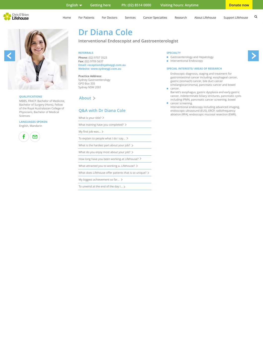
Doctor Profile Page

Changes made

  • Larger image used to feature doctor, to allow the patient/carer to identify who they will be getting in contact with
  • Languages spoken section included for those who are bilingual or prefer to see a doctor who can translate for family members
  • Q&A section added to allow the carer/patient to get to know more about the doctor. This in turn may remove any unsettling anxious feelings they may have towards the doctor as it allows them to build rapport.

Feedback

  • All users liked the clarity and hierarchy of content.
  • The doctor, user tester, liked the Specialty and Special Interest sections being together. The doctor suggested a section where doctors could confirm their billing requirements and if they would support low-income regional patients.
  • One user suggested a line under the doctor name which explained their specialty in simpler terms.
  • Could doctors add video?
  • Could there be a download to doctor’s papers/periodicals?
  • Blue text denotes a link, but not all blue text is clickable. Should the link text colour change?
 

Footer

Changes made

Two options were provided:

  • The first features a more subtle grey with dark grey text as white text on a black background felt a bit of an eye-sore for some of our interviewees
  • The second option features the Lifehouse green as a background for branding with bolded text for easier scannability

Feedback

  • Users liked the darker text.
  • Some users liked the green background, but they could have been influenced by the darker text.
  • Some users liked the aesthetics of the original image, but preferred an actual photo for emotional engagement.
  • The structure of the categories needs to be reduced/ considered and tested further.
  • The bullet points next to categories need to align with the first line of text consistently.
 

Mobile Responsive Navigation Menu

Changes made

  • Four different alternatives were created to visualise the different sizes of the hamburger menu and whether the search and call functions should be featured

Feedback

  • For the first image, one user didn't use the hamburger icon to search for contact details.
  • For the second image, users preferred the hamburger menu to the search option. They liked the bigger hamburger menu.
  • For the third image, users thought the phone icon might bring up a contact us page as opposed to dialling the switch-board.
  • For the fourth image, this option was preferred by majority of the users.
 

Carers Page (New)

Changes made

  • A more emotive image was selected for the hero image to empathise with the carer.
  • A shortcut menu is included under the hero banner, to allow the carer to quickly find the right support that they need.
  • Icons have been used in the shortcut menu to better visualise the purpose of the page.
  • Carer Stories have been included with three main focuses: Finding Support, Multicultural Connections and Coping Remotely. These have been specifically selected to reflect the carer persona's needs.
  • The images selected for the carer stories are of different ethnicities and ages, to reflect the diversity of patients and carers.

Feedback

  • All users liked the icons
  • Users were unsure of categories and felt there was some overlap and ambiguity.
  • The Living Room could work as a content section, not as a button. Users felt it needed more explanation.
  • Everyone loved the Carer Stories. They liked the variety of content - ethnic and regional.
Lab Usability Testing
Opportunities

Lab Usability Testing

The updated site was tested against three users: two carers and one patient.

Working with participants provided by Lifehouse, we first showed them the prototypes as print-outs to get their thoughts on the visuals.

They were then shown the prototype on Adobe XD and asked to complete the following tasks:

  • Finding Associate Prof Sydney Ch'Ng's biography
  • Finding the visitor hours
  • Searching for Dr. Henry Woo
  • Comparing the different mobile navigation options
  • Comparing potential footer updates
  • Reviewing the new carers page

The feedback from the lab usability testing can be found in the Prototype section for each design.


Opportunities

After analysing the entire content journey and a final meeting with the stakeholders, a total of 16 recommendations were discovered for the next phase.

  1. Redesign the footer section of the site:
    • Create uniformity with the categories at the top.
    • Make the text darker to improve accessibility.
    • Add bigger bullet points.
    • Add in a dynamic image of the building.
  1. Review the images on the website for emotional engagement. This comes across as being an important factor and building trust when we talk to people in our one on ones.
  1. Research and develop a true carer portal. Help carers be the 'champion that patients need'.
  1. Include some video. Bridge the experience gap - show 'what’s it like to walk in someone else’s shoe’s'.
  1. Show people what they can expect at the Chris O’Brien Hospital before they arrive, eg, 360 video of areas they will be using, especially The Living Room.
  1. Add practice hours and doctor availability on the ‘Find a Doctor’ page
  1. Create uniformity of language throughout, especially with technical terms.
  1. Build an atomic design library (brand guidelines for the website).
  1. Consider mobile responsiveness of the site.
  1. Further investigate how to improve the breadcrumb area with the visitor details and phone number to make it more noticeable.
  1. Look at making the Donate Now button consistent.
  1. A/B test the home page icons
  1. Make the Living Room a feature not a button and have some text explaining what it does.
  1. Improve search to include journals and publications, (curated search) and auto complete.
  1. Look at restructuring and simplifying the ‘For Patients’ drop down menu.
  1. Investigate the accessibility of the website (colourblind, vision impaired, etc)
Goals achieved

The original goal was to update the website to be more user-friendly for cancer patients.

Our research and analysis, revealed that the carers are the primary users as cancer patients see internet research as overbearing information overload.

Although we didn't create a solution to satisfy the original goal, the goal was achieved as we identified the targer user's need and solved the problem by developing and testing prototypes to address the pain points.

Lessons learnt
  • When you see an outlier in research, explore it as soon as possible
  • Unlearn everything, see the world with no assumptions - it was interesting to discover the stereotype of a cancer patient isn't common
  • Document iterations better, and take photos as you go otherwise, you'll lose proof of revisions
  • Despite the short timeframe, do more low-fidelity prototyping before jumping into digital to ensure the experience can be easily tested against the persona
Experience gained
  • Sprinting during sprints - 2 weeks may seem like a long time, but contingencies need to be made for surprises
  • Scoping projects - Working only on what is relevant and avoiding scope creep
  • Presenting ideas to the stakeholders in the company
  • Encouraging stakeholders to participate in the User-centered design process so they are aware of progress and decisions can be made or be reviewed by those with the final say

Liked this project? View more more below:

Onboarding Re-design

This was a week sprint followed by ongoing changes at Standards Australia to redesign the new starter experience so that they could be comfortable starting work from day one.

View project

Feedback Form

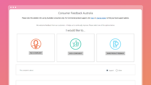
This was a six-month project under Microsoft Australia to personalise the customer complaint experience so that customers can voice their concerns online.

View project

Beat.Box Project

This was a six-week project for the part-time Visual Design class at General Assembly. The objective was to promote a new music streaming service called "Beat.Box".

View project (PDF)

If you have any questions,
please feel free to reach out: